A WORKSPACE TOUR


If you are a reader here for a while, you already know this. I am a stay at home and a homemaker for past few years. I am also an avid crafter/maker and I love decorating my home and blogging about it. As much as I adore blogging I don't consider it as a job or business. It is a passion.

But to be honest this passion is also work. Those who blog know that I am understating it when I say it is a lot of work. And it is also a passion that is fuelled by validation too. Yes, I mean it when I say it. It is incredibly encouraging to have your work noted, being able to talk about it. I think it is with like any other job, though with regular job it is so subtle and common to be part of a team that no one stops for these thoughts.


I must say I like the comfort of calm and peace while I write or make. A place where I could shut down all the noise around me, which is also a dream but for a few hours since I have a little girl. But I didn't take that thought seriously until I came across WeWork, a co-working company with an incredible thought and mission. They strive to create co-working spaces and an inspiring community for freelancers who can rent an office space with all necessary services (food and coffee included) on a monthly subscription basis. You can meet like minded peers and interact and feel the force of community if you choose to do so. A creative space to work and the feel of community, both something all freelancers and makers like me crave for. Interesting isn't it?

So on to the work space "the inspired me" created -


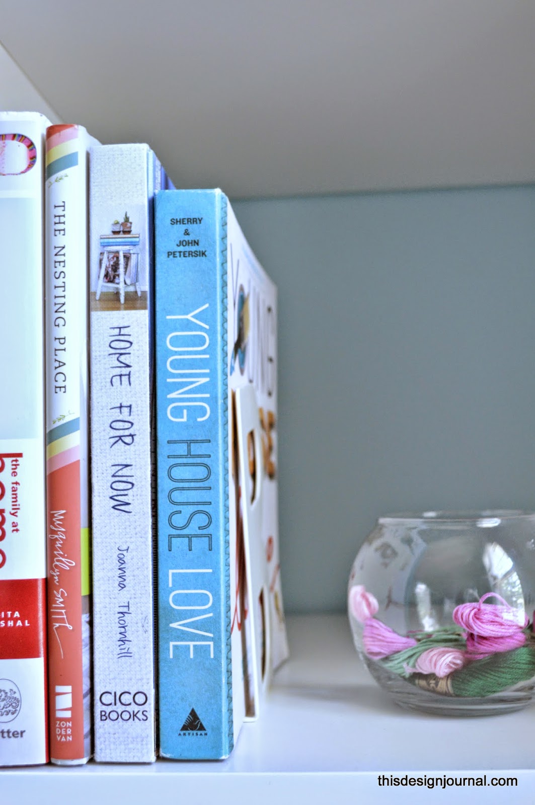
To be honest, it is a basic space though it has all the minimum necessities to function as a creative space. A desk, a comfortable chair, storage, colors for inspiration, knick knacks for decor and simple tools for an organised space.


I have tried to pretty up the shelves and pair down my belongings so that the place and shelves don't look or feel cluttered. It also gives space to grow as and when I need more storage.


There are a number of things I want to add to the space -  more artwork, a DIY Calendar etc. Stay tuned for them.


So how do you feel? Would you be thrilled to join a community that believe in empowering their team to create their own life's work and look after each other and care about the work and welfare of the team?

This post is inspired by WeWork, a co-working company. Please check out the details HERE. Interestingly among the offices they have in almost all the major cities in US and around the world , we have three centres in Washington DC,  here they are. That point is especially interesting for me - a DC girl.


Anima

DIY : STENCILED GLASSWARE READY FOR SUMMER


I love colors which I have proclaimed time and again here. This simple DIY will tell you how much. Because I did this only because I love colors around me, even if that is my kitchen cabinet.


I have had these plain drinking glasses for years now. They function fine and do what they are supposed to do, all fine. Only thing that is troublesome to me was that they are plain, blant . So I decided to give them a makeover with glass paint and some stencils. During the course of it I had to makeover an old tea filter mug too. How about that?

The details - Here we go.

Supplies


Plain Glassware ( I bought mine from IKEA )
Stencils ( or very steady artistic hands) . I couldn't find the same one, but this is a similar one.
Glass Paint ( regular craft paint will wash them away)


Once you have the supplies, this is fairly simple. 


Adhere the stencil to the glass without any air bubbles. Once you fix it, paint on. I found it it is easir with a sponge brush rather than regular brush.


Once you finish, let it stay for one or two minutes and remove the stencil. It is important to make sure to clean the stencil each time after use. Once you are done paint, put the glasses in a convection oven and bake them to the suggested temperature and minutes. I used Martha Stewart glass paint and they were 275F for 30 minutes. Please make sure you read the directions on the paint bottle.

That's it. Done Deal!! You have your colorful and beautiful "new" drinkware ready to rock.


While I was at it, I did paint a few other things too. Couldn't help it. 


So what do you think? what were you up to this weekend?

Anima.

THREE THINGS THURSDAY


It is yet another  thursday and time for another three things that is on my brain .

Some Museum Time


For one, it is memorial Day weekend coming up. We have decided it is also time for some museum experience. We are visiting Richmond, capital of Virginia where you have Virginia Fine Arts Museum and Children's Museum among other things. Last time we went I couldn't devour the Fine Arts museum well, but have decided to make up for it this time. Let us see if I can snap away some pictures for you. There are quite a bit of exhibits from India in the furniture gallery which surprised me.  


Burnside Farms


Last month we visited the tulip garden at Burnside Farms, I think ( I am not sure) only one of its kind in Virginia. The flowers started blooming late this time, but the wait was well worth it. The garden looks even better now that almost all parts are in full bloom.


This Craft we did


There are some crafts which we do just for Akshara's pleasure. This one was one of them. If you haven't tried this with your kids, you must give it a go. It is too much fun and the mess , well this is one mess you would love to see even later. Easy how to : Here on Pinterest .


As you know I join this Three Things Thursday Link up.  Please do visit the link up for interesting stories and information from my blog friends. Our hosts, SalmaRaj and Nisha's blogs. They have all the details on how to join the link up.

Do let me know any interesting things that you care to share with us here.

Anima.

QUICK FIX DECOR : GLASS BOWL PLANTER


Today I want to share something that is exactly what the title says. A quick fix decorating trick.

This is not a new project and I am definitely not the first one to do it. I don't remember where I saw this first time , but I noted it when I saw it at Little Green Notebook. This is a favourite one because this painted bowl has been with me for almost 2 years now but it looks the same then and now. Sometimes simple things that we make with cheapest stuff stays with us the longest.


I use this bowl as a planter for my succulents or faux ones when I kill them. But it could be anything really. It could do anything any bowl does and if you are patient enough it could look much prettier too, well except for any "food" related things.


I bought the bowl from Goodwill for a few cents I believe. Then I painted it with regular craft paint. To be specific, I poured out some paint into the bowl and spread it well and evenly with a brush. Once the paint was dry I gave it a coat of Mod Podge as a sealer. That was it.


For added color I put some decorative stones inside though.


I have directly planted my succulents which do not need a lot of water. If your plant takes a lot of water, it would be ideal to keep it in a planter and put it inside the bowl just to make sure that the paint doesn't bleed. I haven't had an issue till now though. Well other than killing my plants once or twice or thrice - But that is generally me. I have special knack of doing that. But trust me this one has been with me for a few weeks now and we are doing fine.

Do you like what you see here? Please don't forget to "LIKE" us on FACEBOOK  or Subscribe to Mailing List ( On the side bar) to follow along.

Anima.


AN ECLECTIC HOUSE FOR A YOUNG FAMILY

This is the first time I am doing a house tour here. As a serial web surfer I come across so many house tours and I love house tours and to see how people live. So I was excited when I came across this model home that is built for a young family who has a casual way of life but elegant style quotient.

This is a model home set up by Ryan Homes for their Westridge collection of homes. This one is 4 Bed,3.5 bath, added office space and loft space with 2 car garage design. What I loved most about the home is it is the right sized home for a growing, young family. Neither a mansion nor small, which is the winning point in my account.

So here we go , an eclectic home from  Aldie, Northern Virginia,


I have no idea as to who the interior design credit goes, but the home has a good mix of high end and Ikea pieces, they co-exist without any hitch or glare here. This is the foyer area of the home to where the main door opens. It is more of a part of hall way. But the lack of a formal foyer is disguised with this small welcome arrangement. What is lacking there? I would say only a bouquet of  fresh flowers.


To the right is the formal living and next to it the dining space which are defined by a pillar structure in between.


The dining room leads you to the kitchen and main family space through a walk-in pantry and butlers pantry facing each other. I love how the mirrors are used to give an airiness to the space. If up to me, I would have changed the chandelier though. I feel a lighter weight piece would fit better there.

Moving on to the kitchen.


I am usually not a dark cabinets person, but any dark element here is well contrasted and complemented by the white counters and stainless steel appliances. Do you see the white candle holders and black candles? Would you think of using them at your home? But they look so at home here!


Right off is the family living space. A bit low on storage pieces there but we have to remember this is a model home. But otherwise I would say it is well styled and visually calm.


I forgot to take pictures of the breakfast area which has a nice bay of windows letting the sunlight pouring in. The amount of light flowing in beat the disappointment of not having a window in the kitchen.

There is a small office space right behind the family room.


Now the second level, most of the second level is dedicated to rest and relaxing with 4 bedrooms, a loft space and a laundry room.


The Hallway
The hallway has a nice sized closet apart form the laundry room with ample space. This hallway connects all the bedrooms and the loft space.


The master bedroom is one area that I think is overdone with its 2 big walk-in closets. One would have been enough I believe. But I am not complaining because storage space is that - storage space. No one can have enough right!

The design here is a bit traditional, expected with the tile work and - seen too many times - sink design. But then again, this is a model home, designed to please people from all walks of life with varied taste.

These below are snapshots of the guest room. They have used different colors in all bedrooms, but none overwhelming or out of place. The color crazy me loved that.


Next up are the Boys and girls room. Simple, neutral furniture pieces with pops of color on textiles and accessories. Perfect for growing kids and their ever changing tastes. They definitely could use some rugs though. Or is it too much?


I especially loved the pops of colors in the girls room and I also love that the room is blue and not traditional pink. Did you know our little girls room is also "blue" with pops of pinks ? Very similar to this one.


The girl's bathroom also has an interesting choice of color. My iPhone pictures are not doing much justice to the real color and feel of this space.

Below is the loft space, which has plenty of storage, seating and TV, game facilities.


Finally here is the view of the entry from Garage. There is a coat closet and powder room next to the entry.


I wasn't really thinking of blogging about the place when I visited the place with my friend. So the tour really isn't comprehensive. But hope to do a better job next time.

So how did you enjoy the first room tour at This design Journal? Tell me what you love and hate about the place right here. We learn together right!

Anima

*PS : This is not a sponsored post. Ryan Homes don't even know that I exist. Anything written here is my own opinions and feelings about the place.